
Core user and workflow
News editors at Glance (InMobi) use this CMS to ingest, curate, moderate, and publish content to millions of lock-screen users. Every piece of news passes through this pipeline before it reaches anyone.
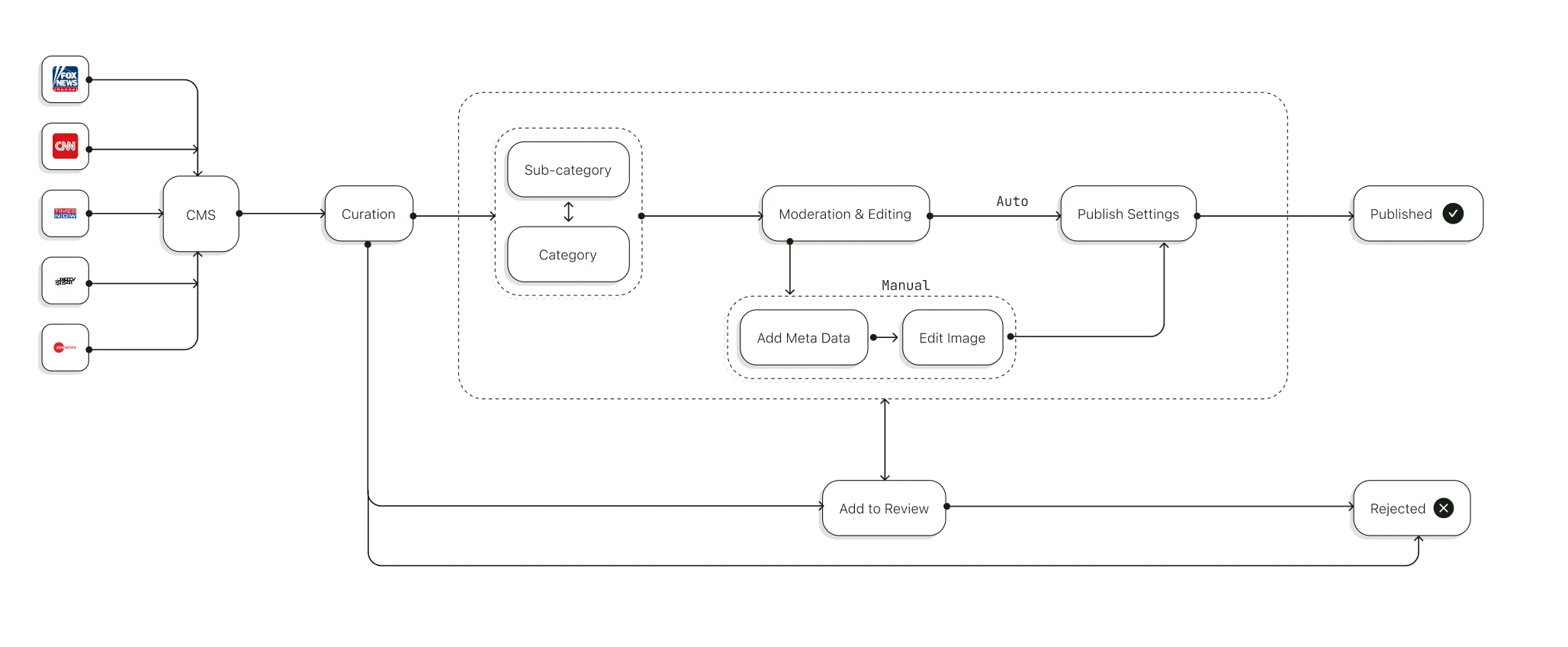
CMS workflow showing Ingestion, Curation, Moderation, and Publishing of content
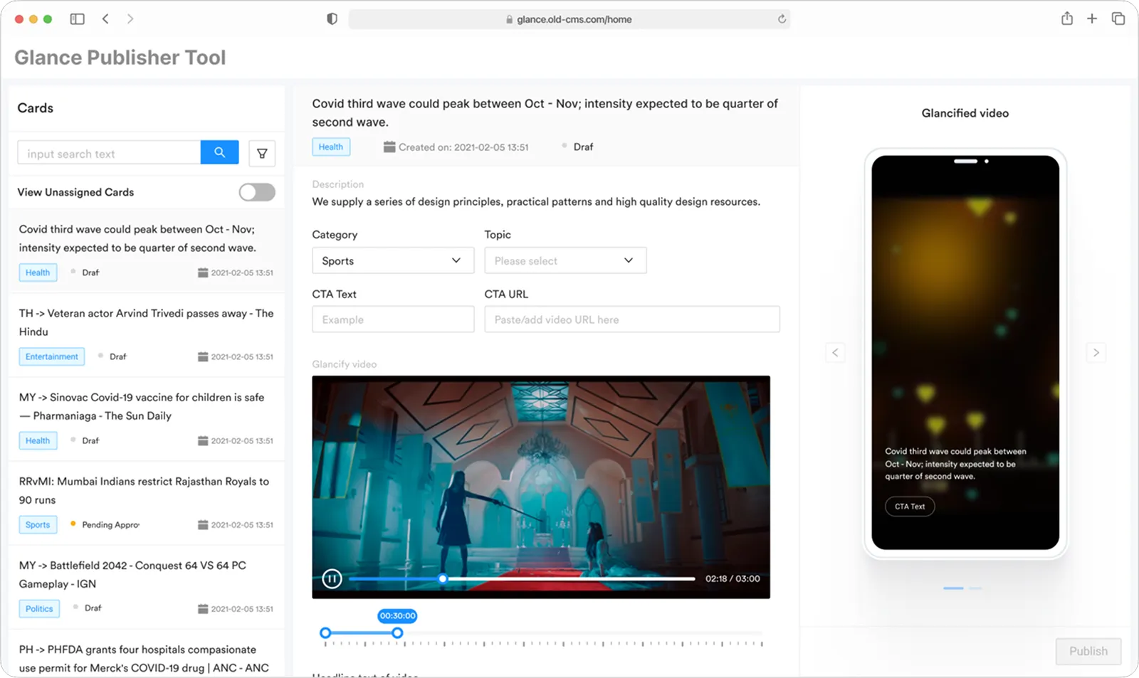
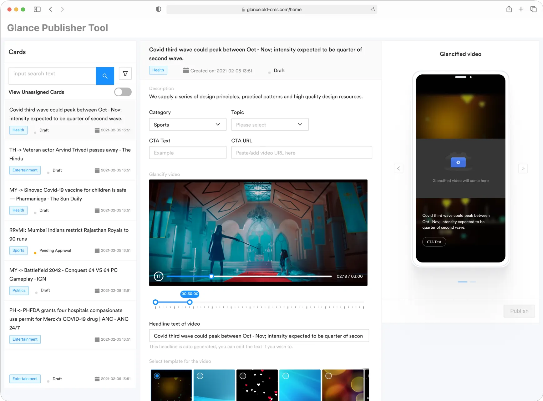
Old CMS interface
Editors were spending ~7 minutes per card and averaging only ~40 cards a day. Every content decision required deep navigation, there were no batch operations, and compliance checks were entirely manual, all of which bottlenecked the pipeline.
Data gathered through user interviews and diary study of inhouse editors.
Slow & Manual Curation

Long Moderation Process

Strategy
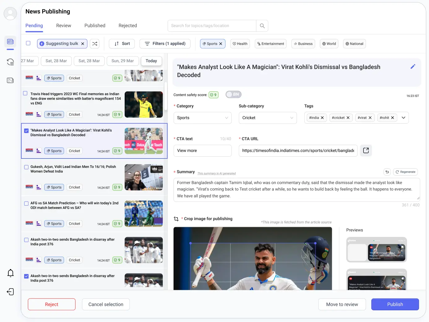
The org wanted the CMS to support richer content formats, so I helped define two new ones: News Story (a chronological thread around a topic) and News Roundup (a curated top-10 from the last 12 hours). My goal was to design a workbench that scales editorial triage while reducing errors through better information architecture, treating safety, governance, and throughput as equal priorities in every decision.
Approach
I started by exploring the core layout, a persistent list alongside content preview and inspector panels. These early wireframes let me test different approaches to information density and filter placement.
[1] Initial wireframes exploring layout variations at Macro level
Two-pane focus, side pop-up menu
Kanban Style content categorisation
[2] Exploring Navigation & Interaction Pattern
Primary nav with 3 column layout showing content flow and interaction
Two column, side pop-up to give more space to upfront info and shift focus
[3] Interactive prototypes demonstrating key workflows at content ingestion level
Standard pagination
Long scroll, Date-wise segregation
Grouped by date
Key Decisions
Chose a persistent three-column layout so list, inspector, and nav never compete for screen real estate.
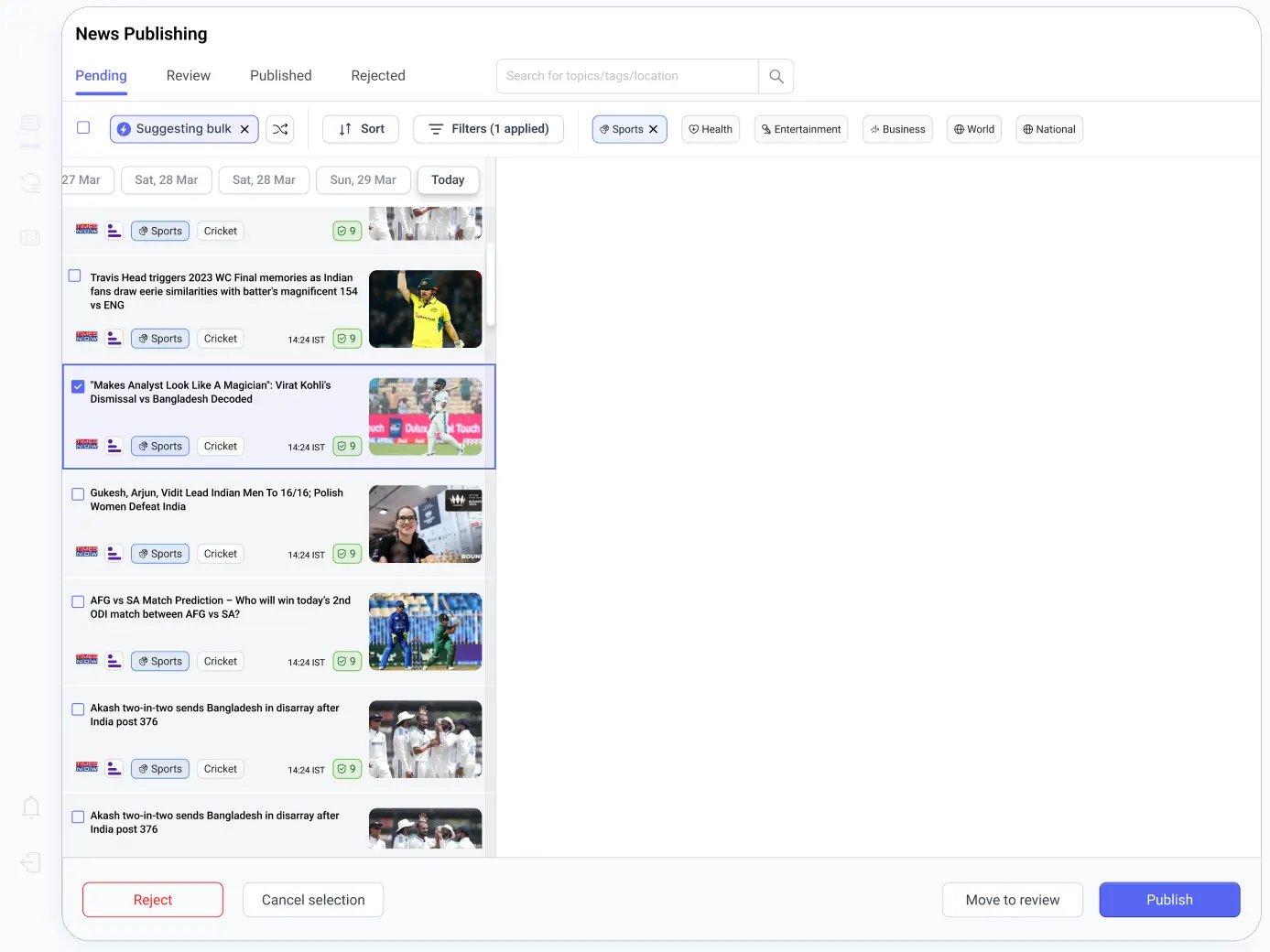
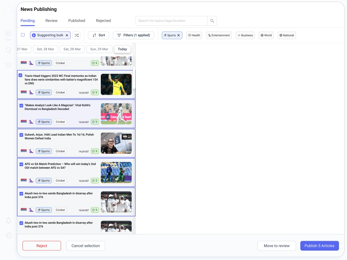
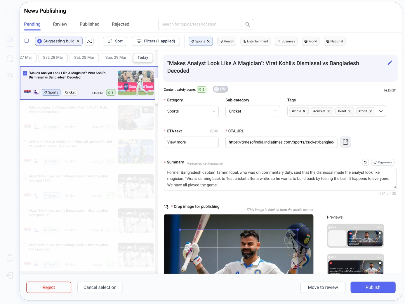
Final Design, CMS Dashboard
A persistent list paired with a focused inspector keeps editors in flow, fewer mode switches, fewer errors. The system sustains fast, accurate decisions under load, with safety and governance built in through ML scoring, markers, and bulk operations.
Toggle between old and new CMS design
Dynamic Content Publishing: News Roundup and News Story
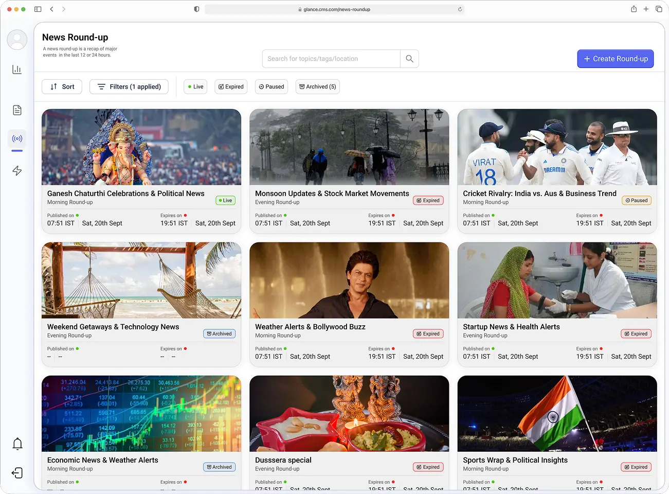
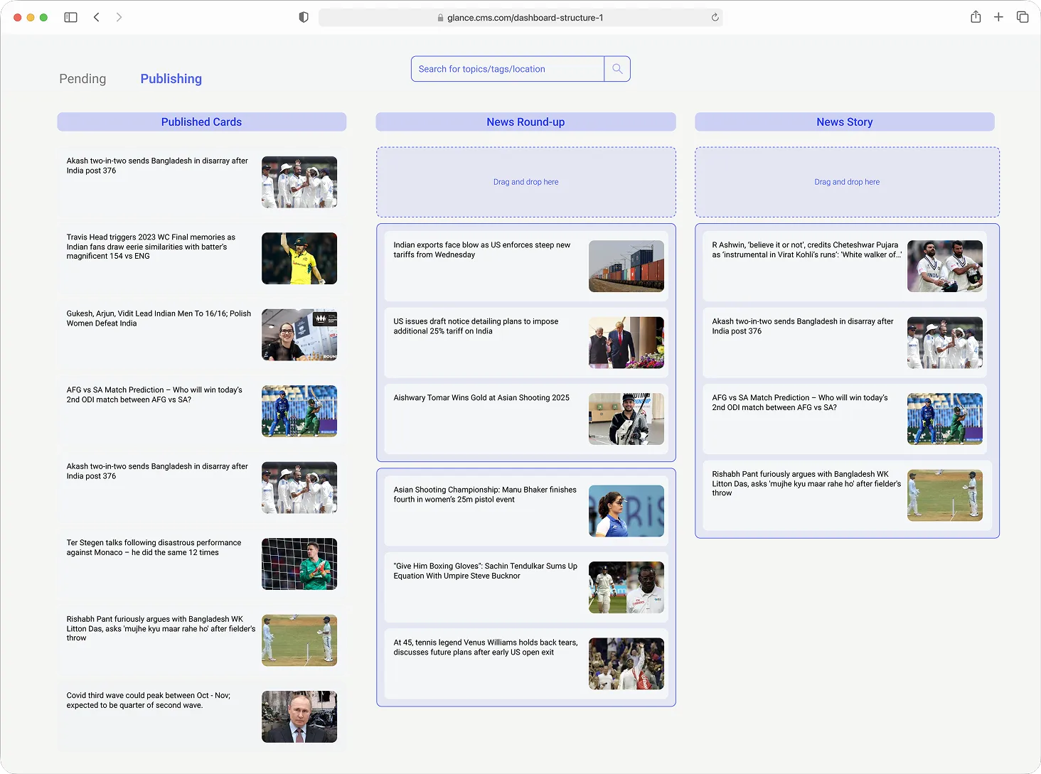
News Round-up listing page
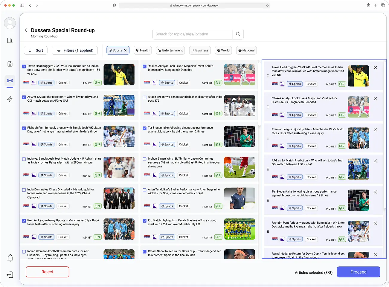
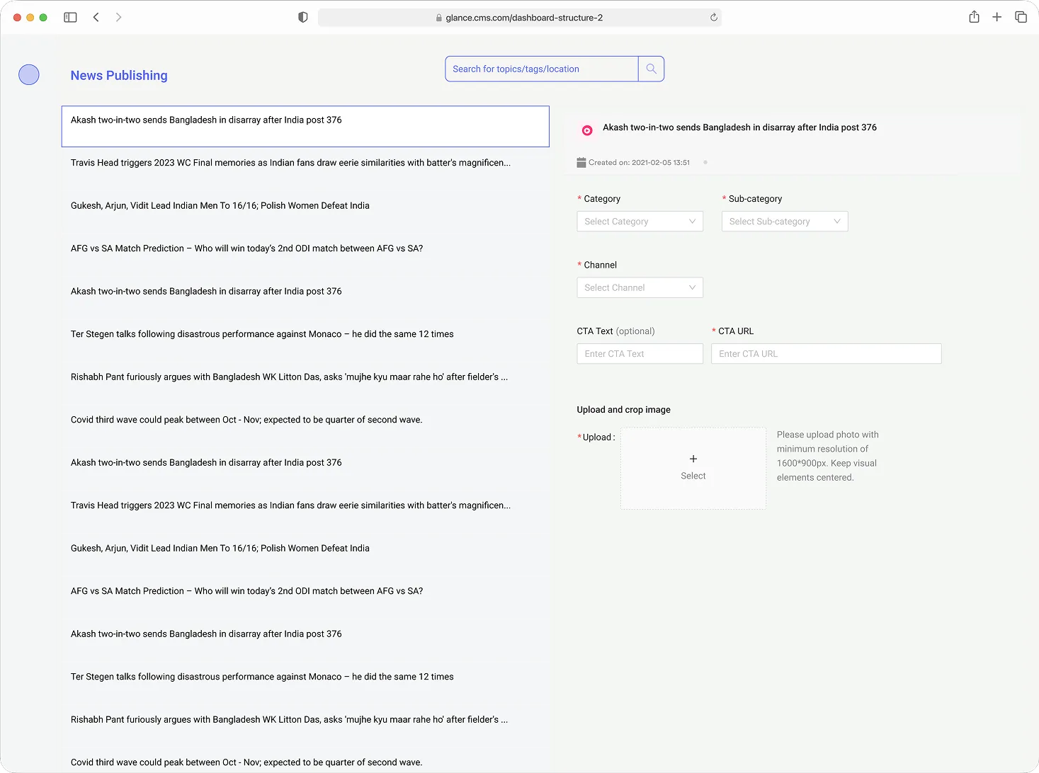
Create a News Round-up
Outcomes
+120%
Throughput per editor per day, from 40 to 88 cards, with no added headcount
-50%
Fewer steps to publish, thanks to fewer screens and better defaults
+8%
Month-over-month lift in engagement time, driven by faster publishing and new content formats